Fix Headshot Background Color in 5 Minutes, Copenhagen Photographer Tips

The safest headshot background for most professional uses is a mid-tone neutral gray. It flatters nearly every skin tone and holds up at thumbnail size. Reach for navy or charcoal when you want to project authority, and go with a soft blurred office or warm neutral when approachability matters more. The one rule that overrides all of it: your face has to separate cleanly from whatever is behind you.
TL;DR:
- Neutral mid-tone gray remains the safest default because it flatters most skin tones and maintains clarity at thumbnail size.
- Navy or charcoal backgrounds signal authority and are ideal for senior or executive roles, but require careful contrast management with dark hair.
- White backgrounds are clean and professional but are unforgiving on exposure and can appear flat if overexposed, especially with light-colored clothing.
- Test contrast and color against your wardrobe and skin tone before shooting, and increase distance from the background to enhance blur and separation.
- Industry norms guide background choice, with finance and legal favoring dark neutrals, healthcare preferring white, and creative fields allowing more personal variety.
Table of Contents
- Why Gray, Navy, White, and Blur Each Work for Headshot Background Color
- How to Choose Your Headshot Background Step by Step
- Matching Background Color to Your Industry and Role
- Skin Tone and Wardrobe Rules That Keep Your Face in Focus
- Common Background Mistakes and Quick Fixes
- Shoot-Day Checklist and Fast Recommendations
- How Savvy Picks Backgrounds During a Shutter Optique Session
- The Psychology Behind Background Color Choices
- Editing Software and Digital Background Options
- How Headshot Background Trends Have Shifted
- The Case for Simplicity Over Trend-Chasing
- Book a Guided Headshot Session With Shutter Optique
- Sources
- FAQ
Why Gray, Navy, White, and Blur Each Work for Headshot Background Color
Every safe background choice earns its place for a specific reason, not just tradition. Understanding the mechanics behind each option helps you pick faster and defend that choice when a client or hiring manager asks why.
Gray works because it is visually quiet. A neutral mid-tone gray doesn’t compete with skin tone, doesn’t shift under different lighting, and survives the two toughest tests a headshot faces: getting shrunk to a 40 pixel thumbnail and getting viewed inside a dark-mode app. Dark charcoal or navy backgrounds can vanish into a black interface; gray never does.
Navy and charcoal read as authority because darker tones create depth and gravitas, which is exactly why so many executive portraits lean dark. The tradeoff is contrast management. Dark hair against a dark background can blur together if you’re not careful with separation lighting.
White gets used constantly in editorial and healthcare work because it signals clarity and cleanliness. It’s also the least forgiving option. Overexpose a white backdrop by even a third of a stop and you lose detail in a light shirt or blonde hair, and the whole frame reads flat instead of clean.
Warm neutrals and muted greens have become popular with modern, client-facing brands because they feel less corporate and more human, without sacrificing polish.
A soft blur, whether it’s an out-of-focus office or a hint of foliage, works because it suggests context without giving the viewer anything specific to look at. Backstage’s own guide on choosing a headshot background puts contrast above every other factor, and a blurred backdrop delivers that almost automatically since nothing behind you is sharp enough to pull focus.
Here’s the quick reference for what each option signals:
- Gray: neutral, safe, universally flattering, best default choice
- Navy or charcoal: authority, gravitas, best for senior and executive roles
- White: clean and editorial, but unforgiving on exposure
- Warm neutrals or muted greens: approachable, modern, common in service and creative industries
- Soft blur: professional context without visual noise
How to Choose Your Headshot Background Step by Step
Picking a background isn’t guesswork if you work through it in order. Skipping straight to “what color looks nice” is how people end up with a headshot that looks great on their monitor and terrible as a LinkedIn thumbnail.
- Decide where the photo will actually live. A LinkedIn profile photo gets cropped into a circle and shown small, so simplicity wins. A CV or portfolio headshot can support slightly more detail since it’s viewed larger and at full resolution.
- Match the tone to your industry and role. A litigation attorney and a wedding photographer are not selling the same story, and their backgrounds shouldn’t say the same thing.
- Test contrast against your wardrobe and skin tone before you commit. Stand in front of the background in your actual outfit and check whether you disappear into it or pop out cleanly.
- Increase your distance from the background to boost blur. The farther you stand from the backdrop, the softer it renders, even with the same lens.
Once you’ve picked a direction, run these checks on the spot rather than after the shoot:
- Crop the image into a circle mentally, or use your phone’s contact photo preview, to catch anything that gets cut off or looks awkward at thumbnail size.
- Check exposure on the background itself, not just your face. A blown-out white wall behind a perfectly exposed subject still ruins the shot.
- Confirm white balance matches between your skin tone and the background. Mixed color temperature (daylight window plus tungsten bulb) creates an odd color cast that’s hard to fix later.
- Look for clear tonal separation between your hair, shoulders, and the background edge.
That thirty-second check catches most background problems before they become forty wasted frames.*
Matching Background Color to Your Industry and Role
The right background does some of the persuading for you before anyone reads your title. Industry norms exist for a reason, and drifting too far from them can send a mixed signal even when the photo itself is technically excellent.
Finance and legal roles call for navy or charcoal almost by default. These fields run on trust and gravitas, and a darker, more formal background reinforces the seriousness of the work. A pastel or heavily blurred outdoor scene undercuts that message even if the lighting is flawless.
Healthcare professionals do better with white or light gray. Clarity and cleanliness matter more here than warmth, and a stark, evenly lit background communicates both. This is one of the few fields where white’s exposure risk is worth managing carefully rather than avoiding altogether.
Real estate agents, consultants, and other client-facing roles benefit from warm neutrals or a soft outdoor blur. These professions live on approachability. A slightly warm-toned background or a hint of greenery signals that you’re personable, not just competent, and client-facing roles tend to favor exactly this look over a stiffer, formal setup.
Creative fields have more room to break the rules. A designer, photographer, or musician can often use black, a textured wall, or an on-brand color if the brief calls for it, since the expectation in creative work is personality over convention. Just confirm with whoever is commissioning the shot, since a portfolio site and a corporate directory listing carry different expectations even for the same person.
Skin Tone and Wardrobe Rules That Keep Your Face in Focus
Background color choices don’t happen in a vacuum. What works depends heavily on your own skin tone and what you’re wearing, and getting this wrong is the single most common way headshots go flat.
Fair skin tends to wash out against light gray or white unless the lighting adds enough shadow definition to create dimension. A slightly darker mid-gray or a warm neutral usually reads better and adds contrast the face needs.
Medium and olive skin tones have the most flexibility. They hold up well against gray, navy, and warm neutrals alike, which is part of why gray became the default recommendation in the first place. It’s the tone least likely to clash with the widest range of skin colors.
Deep skin tones often benefit from lighter backgrounds; a light gray or soft warm tone creates separation that a dark navy or charcoal background can erase, especially if the lighting isn’t set up to carve out edge definition around the hair and shoulders.
Wardrobe matters just as much as the backdrop itself:
- Avoid wearing a color that closely matches the background. Navy jacket against a navy backdrop turns your shoulders into a floating head.
- Skip busy patterns and logos. They compete with your face for attention.
- Choose fabric with some texture or sheen variance rather than a flat, single-tone block of color, which can look like a cutout against a solid background.
Pro Tip: If you’re not sure how your outfit will read against the backdrop, take a black-and-white test shot on your phone. Color differences that look fine to the eye sometimes collapse into the same gray value once color is stripped out, which is exactly what a poor contrast pairing looks like in print or grayscale use.
Common Background Mistakes and Quick Fixes
Most bad headshot backgrounds fail for the same handful of reasons, and nearly all of them are fixable in minutes if you catch them early.
- Busy backgrounds, logos, and strong patterns. Anything with visible detail pulls the eye away from your face. If you can identify objects in the background at a glance, it’s too busy. Saturated or neon colors cause the same problem and tend to date a photo within a year or two as color trends shift.
- Clipping on white backgrounds. This happens when the background is overexposed to the point of losing all detail, which usually also blows out the edges of light hair or a white collar. Fix it by metering for the background separately or adding a stop of negative exposure compensation.
- Color casts from mixed lighting. A greenish or orange tint across the whole frame usually means two different light sources with different color temperatures. Fix it by using one consistent light source or correcting white balance in post.
- Poor thumbnail legibility. A background that looks fine at full size can turn muddy or confusing once shrunk down. Fix it by previewing the image small before finalizing your selection.
When in doubt, the fastest fix across all four problems is the same: step back to increase blur, or swap to a plain mid-gray backdrop and start over from a cleaner baseline.
Shoot-Day Checklist and Fast Recommendations
Print this list or screenshot it before your next session. Running through it takes under two minutes and catches most of the mistakes that ruin an otherwise good shoot.
- Primary use confirmed (LinkedIn, CV, company site, portfolio)
- Lighting checked for even exposure across face and background
- Distance from background set to at least a few feet for natural blur
- Blur test shot taken and reviewed at full zoom
- Thumbnail crop previewed, including circular crop for LinkedIn
- Backup neutral (plain gray) ready in case the primary choice doesn’t test well
For fast decisions, the pattern holds pretty consistently: gray is the default for corporate directories and LinkedIn, navy or charcoal for leadership and finance, white for healthcare and editorial (watched carefully for exposure), and warm neutrals or a soft blur for anyone in a client-facing or creative role who wants to look approachable rather than formal. First impressions form fast at small sizes, and the background does a lot of that early work before a viewer even fully registers the face.
How Savvy Picks Backgrounds During a Shutter Optique Session
Every Shutter Optique headshot session starts the same way: a few quick preview shots against two or three background options before committing to a full set. It’s faster than debating in the abstract, and clients almost always know within seconds which one feels right once they see it on screen.
A client who came in expecting a plain gray backdrop for a finance role sometimes leaves preferring a soft blurred cityscape once they see how it reads on camera, warmer, more approachable, still clean enough for a corporate profile. Other times the reverse happens: someone booked for a personal brand shoot decides navy actually fits their message better than the warm tone they’d imagined. Photographers who shoot quick preview sets like this tend to avoid the costly reshoots that come from picking blind.
That flexibility, paired with professional retouching and a fast turnaround, is the difference between guessing at a background choice from a stock photo and actually seeing how it looks on you before the shutter clicks for the final set. Sessions booked through the Copenhagen headshots page include exactly this kind of guided background testing as standard.
The Psychology Behind Background Color Choices
Color doesn’t just decorate a headshot. It changes how fast a viewer forms a judgment, and it does so before they’ve consciously registered anything about your expression or outfit.
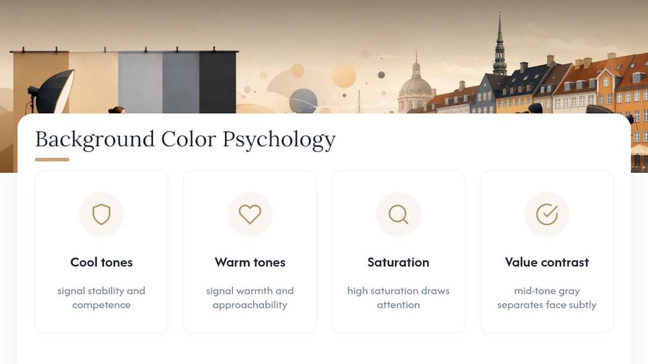
Cool tones like gray, navy, and blue read as stable, competent, and controlled. That’s not an accident of taste; it’s a pattern strong enough that it shows up across corporate branding, uniform design, and yes, professional photography. Warm tones (soft beige, warm gray, muted terracotta) read as inviting and human, which is exactly why service-oriented and client-facing professions gravitate toward them.
Saturation matters as much as hue. A highly saturated color, even a “safe” one like blue, pulls attention away from the face because the eye is drawn to the most vivid element in a frame first. That’s basic color theory: saturated colors advance visually while desaturated, muted tones recede. A headshot background should always recede. The face is the subject; the background is the setting, and setting should never outcompete the subject for attention.
Value contrast (how light or dark something is relative to what’s next to it) determines whether a viewer’s eye lands on your face immediately or has to work for it. A mid-tone gray behind most skin tones creates just enough separation without demanding attention, which is the exact effect a well-chosen background is supposed to produce.
Editing Software and Digital Background Options
You don’t need to get the background perfect in-camera to end up with a clean final image, though starting close saves time in editing.
Modern retouching workflows commonly involve subtle background adjustments: evening out a mottled gray backdrop, correcting a slight color cast, or gently increasing blur in post to match the depth of field a wider aperture would have produced. These are refinements, not reinventions. A skilled retoucher enhances what’s already there rather than replacing it wholesale.
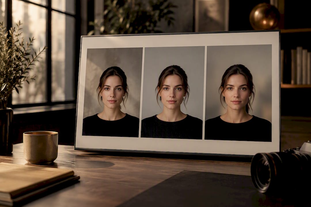
Full background replacement is also common now, particularly for corporate headshot programs that need every employee photographed against an identical, uniform color regardless of where or how the photo was taken. AI-assisted tools can now swap a background entirely, which works well for standardizing a large team but tends to look artificial for an individual personal brand or portfolio shot where authenticity is the point.
The practical middle ground, and the one most professional photographers favor, is shooting against a real, well-chosen background and refining it in post rather than replacing it outright. It keeps the natural falloff of light and the true color interaction between your skin, wardrobe, and setting, which is much harder to fake convincingly than it looks. Solid neutral backdrops or a soft blurred office remain the most reliable starting point precisely because they hold up whether you retouch heavily or barely at all.
How Headshot Background Trends Have Shifted
Headshot backgrounds have gone through fairly distinct phases, and knowing where the trend line sits right now helps you avoid a look that reads as dated the moment it’s taken.
The 2000s and early 2010s were dominated by flat, seamless studio backdrops, usually a single solid color like slate blue or gray, shot in a controlled studio with hard, even lighting. It photographed consistently but often looked sterile.
Through the mid to late 2010s, the blurred outdoor or urban background gained ground fast, driven partly by the rise of mirrorless cameras with wide apertures and partly by a broader shift toward “authentic” personal branding over stiff corporate polish.
More recently, the trend has split by role rather than moving in one direction for everyone. Dark neutrals and navy are climbing for executive and senior portraits, while warm neutrals and soft outdoor blur continue to dominate for client-facing and creative roles. Rather than one dominant look, the current era is defined by intentional matching. Background choice increasingly gets treated as a branding decision, not an afterthought, which is exactly why so many people now research the topic before ever booking a session instead of just showing up and standing in front of whatever backdrop is available.
The Case for Simplicity Over Trend-Chasing
Most of the conventional advice on this topic is right, but it’s incomplete. Guides tell you gray is safe, navy signals authority, and blur suggests warmth, all true. What gets skipped is that the biggest failures aren’t color choices at all. They’re contrast failures: navy hair against a navy wall, a washed-out white shirt against a white backdrop, a saturated color pulling focus from a tired face. Get contrast right first, and almost any reasonable color choice will work.
The other gap in most advice is treating background selection as a one-shot decision made before the camera comes out. In practice, the fastest way to get it right is to test two or three options in the first five minutes of a session and look at them on a screen, not guess from a mood board. That single habit, more than any specific color recommendation, is what separates a headshot that works from one that needed a reshoot.
Prioritize contrast, test before you commit, and let the industry norms guide you rather than dictate to you. The rest is detail.
— Savvy
Book a Guided Headshot Session With Shutter Optique
Getting the background right on your own takes trial and error. A guided session skips that entirely: Shutter Optique headshot sessions include posing direction, background selection tested on-site with quick previews, professional retouching, and delivery within one to two weeks.
During your session, Savvy runs the same contrast and thumbnail checks covered above in real time, testing a neutral gray against a soft blur or a navy option so you can see how each reads on camera before committing to a full set. No modeling experience required and no guessing which background will actually work once it’s cropped into a LinkedIn circle. Headshot sessions are priced at 1,000 DKK and booking starts on the headshots page, where you can check availability and reserve a time slot directly.
Sources
- How to Choose an Effective Headshot Background | Backstage
- Headshot Backgrounds: 10 Styles Compared | Portreya
- 15 Professional Headshot Backgrounds + How to Choose (2026) | Capturely
- Professional Headshot Background: How to Pick | Imagera AI
FAQ
What color background is best for headshots?
Neutral mid-tone gray is the safest choice for most professional uses because it flatters a wide range of skin tones and survives thumbnail crops. Navy or charcoal works better when you want to signal authority, and a soft blurred office suits client-facing or creative roles that call for warmth over formality.
What colors should I avoid for headshots?
Skip busy patterns, visible logos, and highly saturated or neon colors, since they distract from your face and tend to date the photo quickly. Also avoid wearing an outfit that closely matches your background color, since it can make your shoulders and head look disconnected from your body.
How do I change a headshot background color?
You can shift a background in editing software through color correction, blur adjustments, or full background replacement using AI-assisted tools, though full replacement can look artificial for personal branding shots. The more reliable approach is choosing the right background before the shoot and refining it lightly in post, which is the method Shutter Optique uses with its guided headshot sessions.
What should I avoid in a headshot background?
Avoid anything with visible detail, text, or objects that compete with your face for attention, along with backgrounds that clip or blow out under bright exposure. Test your outfit against the background beforehand to catch any color that causes you to blend in rather than stand out.
Does the background color affect how professional a headshot looks?
Yes. Cooler, desaturated tones like gray and navy read as more composed and professional, while highly saturated or busy backgrounds pull focus away from the face and can undercut an otherwise strong photo. Contrast between your skin, wardrobe, and the background matters more than the specific color you pick.